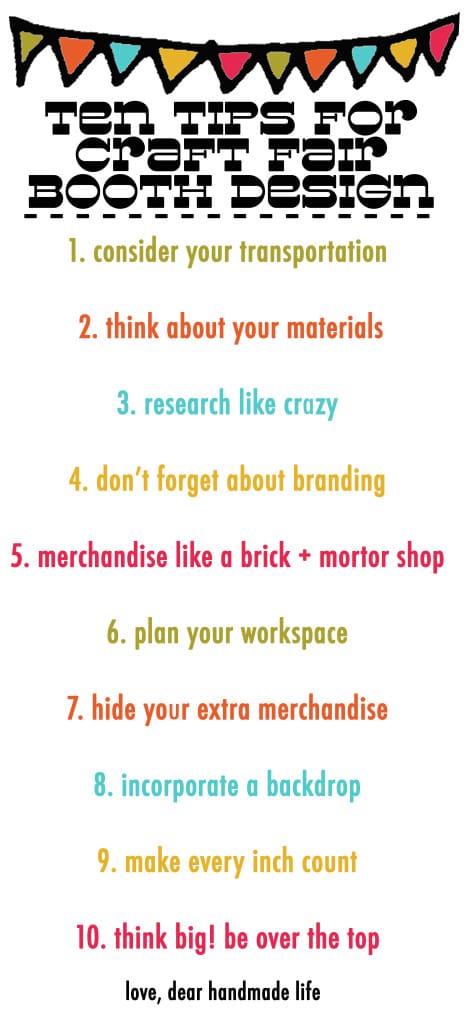
ten tips for craft fair booth design
 *Editor’s note: We’re so happy to have this guest post by Janie of Janie XY on Dear Handmade Life today. She is one of the queens of booth display and we were overjoyed when she asked us if she could share her tips for creating mind-blowing booth displays at craft fairs with our readers.
P.S. – We’re also big fans of our Craftcation Business + Maker’s Conference presenter Mallory Whitfield’s book How to Make Money at Craft Shows.
If Janie’s awesome tips and suggestions for creating an awesome booth display inspire you to take your craft show game to the next level be sure to check out our online workshop:
Craft Show Success: Make sales and build your business, confidence + community through selling at craft shows.
I share the tips and tricks I’ve learned from vending at over 300 craft shows and producing over 40 of them. You’ll learn how to: find and apply to the right show, develop your “look” using basic branding, prepare for shows with products, checklists, staff, and a pitch, merchandise and display products for maximum effect, deal with pricing, permits, and taxes + MORE!
Craft Show Success teaches you how to:
- Find and choose the right craft shows for your brand
- Determine and achieve your craft show goals
- Get organized and be prepared before, during and after craft shows
- Submit a stand-out application with great photos
- Create cohesive branding for your business
- Maximize your booth space and create unique on-brand displays
- Price your goods for profit
- Navigate licenses and permits
- Maximize your time at the show
- Build and solidify relationships with your customers, creative community and show producers
Click below to preview our Craft Show Success online workshop.
-Nicole S.
Now onto Janie…
Hi there, I’m Jane Ragasa, the girl behind those squishy fruits, animals, rattles, and digital DIY patterns over at Janie XY Handmade Toys. I’ve been creating toys since 2009 and have participated in over 25 shows including Unique LA (where I won the award for best table display in 2010), Renegade Craft, and Patchwork Show so it’s safe to say that I know what you’re going through.
You have your entire product line finished and ready to be sold and you’ve just received your acceptance email from a major craft show. Thousands of people will be attending and you have to stand out among possibly hundreds of vendors. Now you have to think of a display. Here it comes—panic mode. Don’t worry. We’ve all been there. Repeat after me, you’re not alone!
I’ve been there so many times now that I’ve probably made every mistake you can think of along the way, even some that are embarrassingly obvious.
So fear no more, you now can all learn from my mistakes and create your own wonderfully whimsical and smartly designed display. Here they are, the 10 lessons Sergio (my boyfriend/builder/expert toy stuffer) and I have learned from building displays.
Transportation
This is one of those embarrassing mistakes we’re guilty of. On our food truck display, we didn’t think about how it was going to fit into the car or how we were going to carry it. Big mistake.
- Measure your car’s trunk, door openings, and every nook and cranny you think you can squeeze your display into and don’t forget to factor in your product too!
- Get a hand truck or dolly. Once you leave your car, that display is going to need to travel “x” amount of feet and you have a long day ahead of you, so make it easier on yourself by investing in a compact hand truck that will work on both smooth surfaces and grass.
- Tie downs, tie downs, tie downs! These will be well worth the $20 it costs. It will help keep your display and product on the hand truck so you won’t get nervous every time you roll over a crack.
Materials
That food truck display was full of lessons for us. Our second biggest regret with it was that it was insanely heavy. At the time, we were only familiar with materials we’ve seen in house renovations: 2”x4” wood, dry wall, particle board, etc. We didn’t even think about how heavy (and expensive!) those materials were.
- Use lightweight materials! Check 1”x2” wood for frames, 1/8” luan boards or MDF. Think foam, plastic, etc. You don’t want your display to be so heavy that you can’t lift it out of the car.
- Reuse. You’re going to use your display (hopefully) at least once so try not to create displays that need to be screwed together every time. This weakens it and leaves ugly holes everywhere that will need to be retouched every time. Heavy clamps are a great alternative.
Research
A great way to find alternatives to those pesky screws is to do your research. Pinterest is a great starting point, but try to go out and see how others are building things. On your next shopping trip for lunch out with friends, pay attention to how stores display things, what kind of fixtures they use and how they’ve built it.
- IKEA – excellent examples of how to build things quick. Notice a lot of their furniture is does not require a drill and is collapsible. Perfect for your display!
- Anthropologie/Urban Outfitters – ideal for inspiration on repurposing materials and furniture, but remember that your version will most likely need to be collapsible, so keep that in mind while researching here.
- Vintage Furniture Stores – Pay close attention to how their furniture is built. I learned that table legs were removable before and their techniques have helped tremendously while designing my own displays.
Branding
It’s embarrassing to admit that this is something I often forget to this day because I get so caught up in designing the display itself. It’s kind of like doing an amazing book report complete with illustrations and turning it in without your name on it (which is something I was often guilty of while I was in school). People need to know your name and what you do!
- Never forget to place your brand name in a spot that can be seen even when your booth is crowded. It’s great for customers that are looking for you, as well as press that’s covering the show. Instant advertisement!
- Find a home for your business cards that’s easily accessible by your customers. Shy customers love it when your business card is on the edge so they don’t have to commit to talking to you and quickly pick up of your info.
Merchandising
It really does matter how you place your products. There isn’t an exact formula but you should keep a few things in mind:
- Build up! Think about bringing your products up to eye level or close to it. Customers rushing through aisles are more likely to see products placed higher than spread on a table.
- Pay attention to how customers interact with your product. Are they not touching a particular product? Could it be that they are afraid it will fall over? Make it easy for them to shop your booth.
- If something’s not working, don’t be afraid to rearrange it during the show.
Plan Your Workspace
Four years 6 displays later, we finally have dedicated drawers for the cashbox and other tools we always need at shows. I cannot express how happy I am about this!
- Decide how much space you truly need to charge customers, store business cards, small tools, tagging guns and extra hangtags. Factor that into your display plans.
- Designate a space to keep shopping bags and other packing materials for sales.
Hide Your Extra Merchandise
This one is pretty simple. I keep all my merchandise in big plastic bins that stay behind our chairs, but those bins aren’t exactly the cutest bins. So, I keep a little tablecloth in a fabric that matches our display to drape over it.
Other hiding spots ideas: Behind a backdrop, Inside your display or Under your table
Backdrops
They’re amazing. It’s something I always knew but never tried until my last show. It completely transports the customers into your own tiny pop up shop. And makes your fellow vendors fade into the background. You want a backdrop that is eye catching, matches your design, but doesn’t take away from your product.
Suck It In
I’m sure you’ve seen those YouTube videos of people that live in impossibly small apartments and completely transform it into a comfortable living space. Well, for the duration of your show, you are living in a 10’x10’ or smaller apartment. Make every inch count!
- Create a display that can break down for transport
- When built, it should comfortably fit all your merchandise and yourself. (I almost always forget that I too have to live in the booth, so I don’t consider the space I need to stand, turn around, or sit.)
Be Too Much
Disneyland is awesome because every detail is thought of and they completely commit to their themes. Your booth is your product’s theme park. What kind of land would you product live in? What kind of colors and styles would it like? It’s okay to be over the top. You’re only taking up about 10 feet, and I always think it’s better to go over the top with small spaces than to be afraid to take risks. Those make the most memorable booths.
So there you have it! Ten big lessons we’ve learned along the booth-building path. We’d love to see your creations and if you have any questions, feel free to contact me at jane@janiexy.com!
-Janie Ragasa
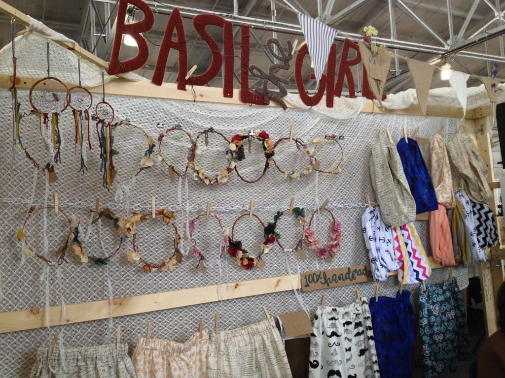
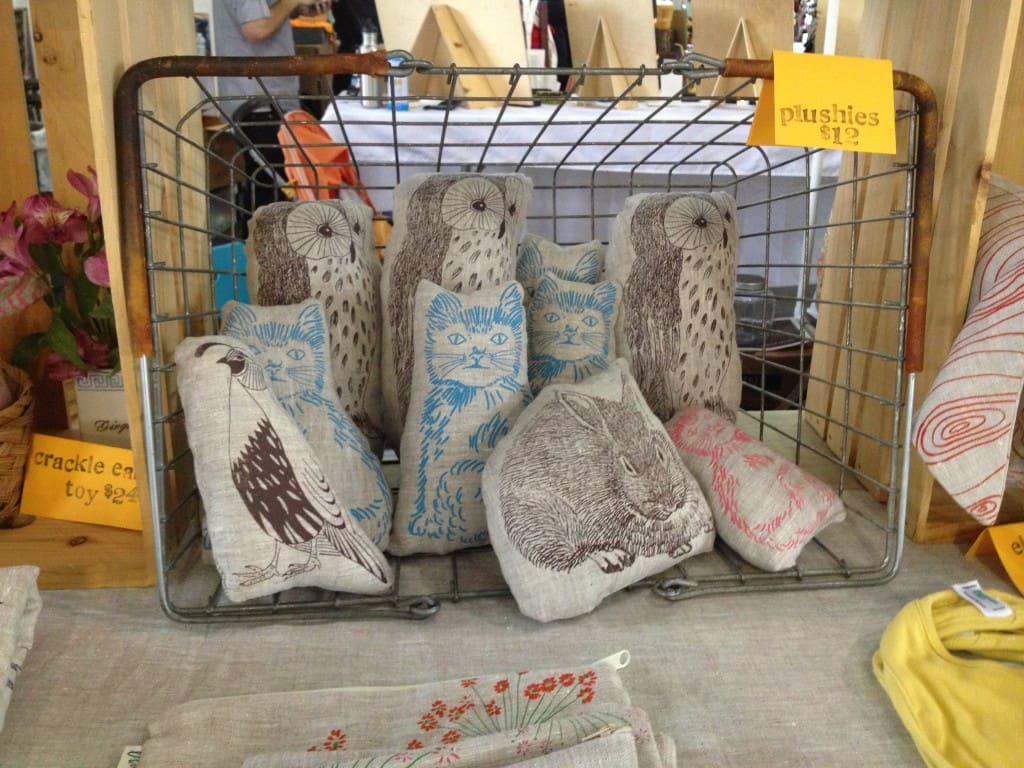
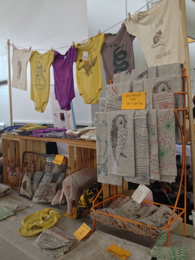
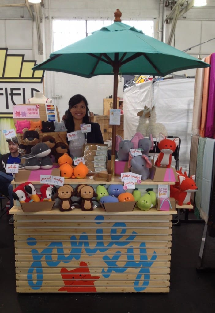
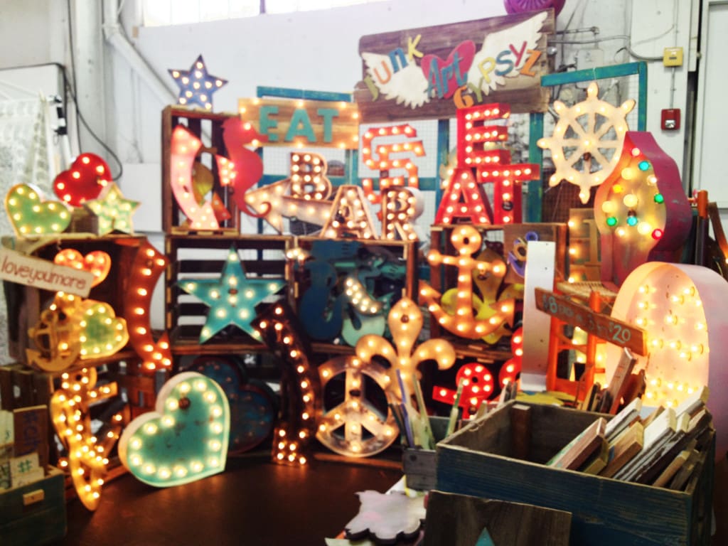
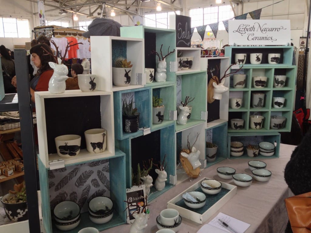
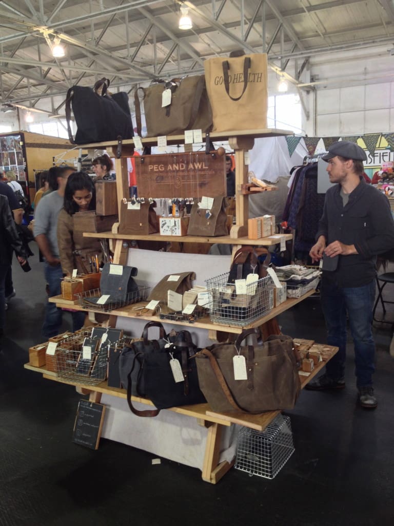
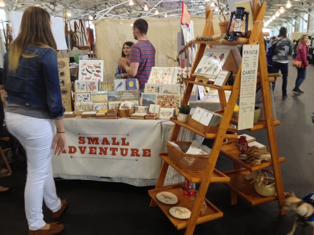
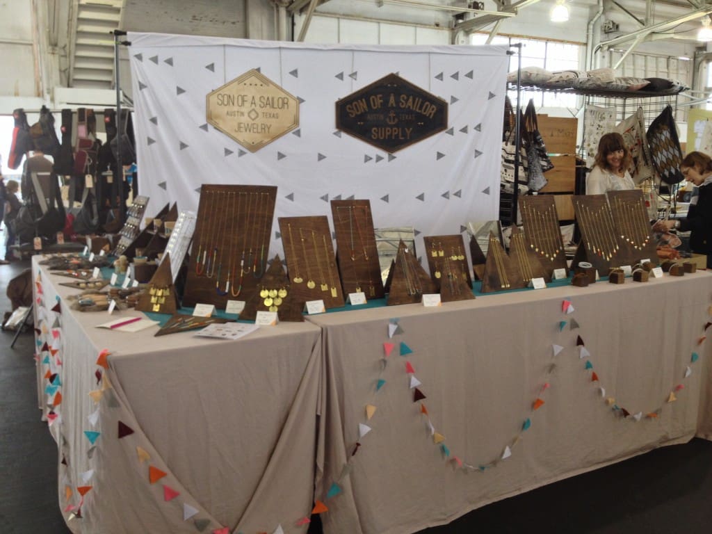
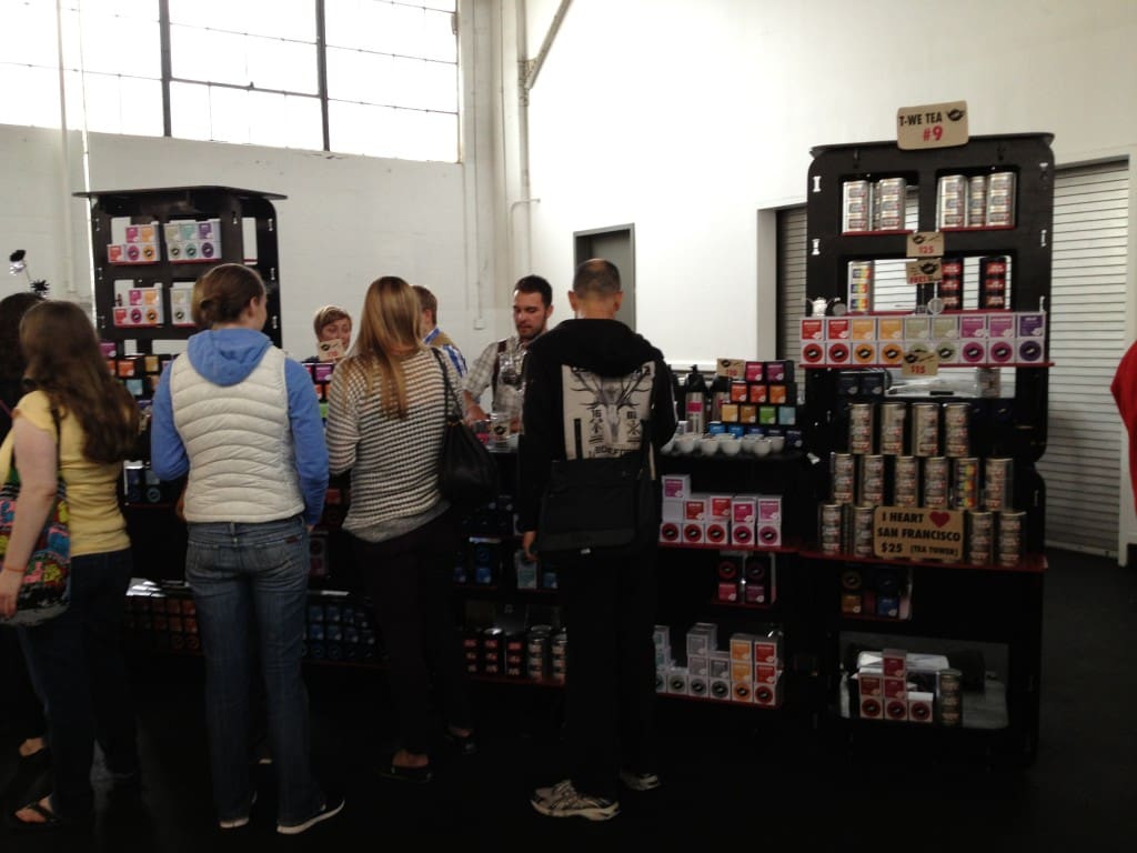
Here are some of Janie’s photos of a few of her favorite booth designs:
About Janie:
Jane Ragasa is a self taught toy designer and an actual Valley girl, born and raised in North Hollywood, CA. She currently runs Janie XY Handmade Toys with her high school sweetheart and partner in crime, Sergio Jauregui. You can give her cuddly plush animals and food a virtual hug at janie xy.


Thanks for the great tips! My favorite: be too much 🙂
hi jana! i thought her tips were pretty awesome too! she did a great job covering everything…as a vendor, it took me years to learn this stuff!
-nicole
Hi Jana! Thank you so much! I hope that they help you out with your next booth display. Please feel free to contact me at jane@janiexy.com if you need any pointers or have questions. Have tons of happy “making” adventures!
-Jane
Hi, I found your article helpful but I thought your first point, 1. consider the transportation was somewhat over-rated. Anyone with common sense would have that to worry about/plan BEFORE you even consider taking your show on the road.
And to the Blog Monitor, I think that if you’re going to have punctuation (periods at the end of your sentences), you should also capitalize the first word of your sentences as well as proper names. We’re losing too much of our English language to texting without it also being thrown out in blogs as well.
Hope you take this as constructive criticism; have a great day!
hi arleen,
thanks so much for your honest criticism. you’d be surprised at how people don’t actually think about their transportation. i’ve produced over 27 craft shows and have heard this from vendors more times than you’d imagine. of course it seems obvious but when they have so many things to think about, some can be overlooked. 🙂 as far as the lowercase letters. it’s an aesthetic choice. we think about letters not just as a way to communicate but also part of the overall look and design of the blog. totally appreciate your comments though 🙂
-nicole
Hello!
I appreciate your comparison to a small apartment as well as the suggestion for a backdrop. It really helped me to reimagine my booth as a cohesive shop with a layout, design and personality.
– Jennifer
I make neck wraps with a removable/washable cover. They lay flat. Any cool ideas on how to display flat items that have some weight to them? Thanks, Neck Wrap Gal
There are some good points here. I have done a few shows and I know that there is lot that goes into this. A lot of this is how you managed to catch the eye of the person walking past your stall. These are all good points in getting to that place.
Thank you for these wonderful tips! I am a beginner and valued everyone of them. “Be too much”–Love it!
Do you have any recommendations for the props to hold a backdrop—like for son of a sailors display?
you can make a frame out of PVC pipe or use a photo backdrop frame like this: https://www.amazon.com/s/?ie=UTF8&keywords=backdrop+frame+stand&tag=googhydr-20&index=aps&hvadid=153711924427&hvpos=1t1&hvnetw=g&hvrand=11743911436332395302&hvpone=&hvptwo=&hvqmt=b&hvdev=c&hvdvcmdl=&hvlocint=&hvlocphy=9032310&hvtargid=kwd-49003702789&ref=pd_sl_28ospfgeli_b