eight product packaging tips + all my ex’s
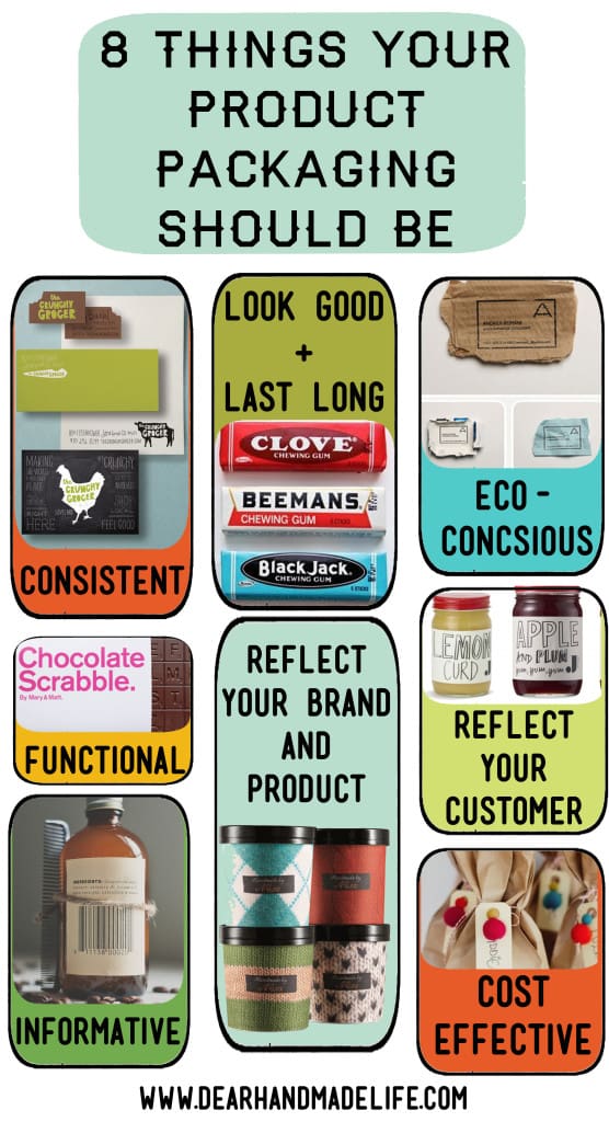
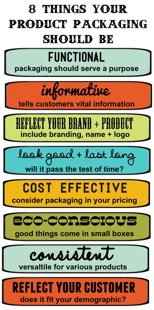
8 things your product packaging should be:
if all my ex’s were in room together and a stranger walked in and was asked, “what do all these people have in common?” chances are the stranger would run through a hundred scenarios before guessing that they all dated the same woman.
for the most part i don’t have ‘a type’. In that room you’d find a veterinary assistant, a freakishly tall red head, someone just a few inches shy of medically being considered a dwarf, a very clean cut hearing impaired guy, an la punk rocker with more tattoos than i could count, people whose body types range from extremely overweight to athletic, an army guy, a junkie (or two), a 9 to 5 corporate gentleman in a starched button up and blazer, a socially awkward bio-chem major who still lived with his parents, a comedian, a long haired poet, an even longer haired vegan hippie, a polished banker, a bearded chef, an artist, an anthropology major, a ceramicist, a ukulele player and…a few ladies.
there are a few commonalities. a handful of them were bartenders, doormen and alcoholics. a shockingly high number of them played guitar. but none of them would ever be called to the same police line up. it’s not that i don’t care about looks. of course you have to be attracted to the person you date. for me, that attraction stems from that first intimate conversation, not from how their hair is styled or what kind of jeans they’re wearing. i recently married a man who wears less than perfect jeans and rarely thinks about what his hair looks like. we spent one perfectly imperfect week in montreal on our honeymoon.
although i tend to ignore the outer package when i pick my mates, when i’m shopping, it’s all about the packaging. Embarrassingly, i’ve spent $15 on a bottle of shampoo because i liked the color combination and font on the label. i’ve been suckered into spending $30 on a soy candle because it came in a sturdy box and had a piece of twine and a wax stamped seal. a $12 jar of jam that looks like it was made by my long lost great aunt, of course i’ll take it!
i know i called myself a sucker but, i don’t feel like one. when it comes to things, the packaging is part of the product.
you can make the best smelling, longest lasting soy candles in the world but if they’re just in a plain glass with no label or tag, chance are customers won’t be drawn to them (unless your customer is an ultra minimalist). Talking about how we present our businesses, the term branding gets thrown around a lot. branding is what distinguishes your product from everyone else’s. your packaging, like your product itself must reflect the uniqueness of what you create as well as your business. once you figure out the ‘who’ of your business, the next step is to make your packaging mirror that vision. after over a decade making a living at creating, packaging and selling things, i’m ready to share my eight tips for creating killer packaging.
8 things your packaging should be:
FUNCTIONAL:
if you make t-shirts and people have to try them on, don’t put them in a bag. if you make candles, people will want to smell them. don’t put them in an box that can’t be opened. i made tea towels and knew tons of hands would be grabbing them at craft shows, so i put them in clear bags. i also knew that some customers would want to see the whole towel, so i always had one towel out of the package on display.
INFORMATIVE:
people want and need to know the facts! This is especially important if you make edibles or bath and body products but relevant for anything that comes in contact with customers, like clothing or jewelry. include what your product is made of! with more people shopping locally and consciously, it’s also nice to include where or even how your product was made.
REFLECT YOUR BRAND & PRODUCT:
colors, fonts, design and composition should all reflect your branding. be sure your name and/or logo are on your box, bag, hang tag or other packaging materials.
LOOK GOOD/LAST LONG:
don’t follow design fads. do pay attention to design trends. do some research and figure out the qualities of packaging that has stood the test of time. you want your packaging to look sharp but also don’t want people to be able to pinpoint when you made it. your packaging, like your product should still look and feel relevant long after you’ve made your sale.
COST EFFECTIVE:
if you come up with a genius packaging idea that costs more than your product, chances are you should go back to the drawing board. you must factor packaging into the price of your product.
CONSISTENT:
customers should be able to look at your packaging and know right away that it’s yours but it also must be versatile. think about how your packaging would look in different sizes. is it flexible enough to grow as your business grows? maybe now you only make t-shirts but someday you made add jewelry to your collection. how will your branding and packaging fit onto a smaller tag?
ENVIRONMENTALLY CONSCIOUS:
think about using recycled paper or materials as well as the size of your packaging. if you make earrings do they really need to be in huge box, even the box is super cool?
REFLECT YOUR CUSTOMER:
assess your customer. really think about the people who buy what you make. are they environmentally conscious? then be sparing with your packaging and be sure to note if you’re using recycled materials. are they high-end design savvy shoppers? Then go for the gusto and make sure your product comes in a package that’s worthy of their aesthetic sensibilities.
now that i’ve shared the eight secrets to creating great packaging… here’s the biggest secret. these rules can easily be broken…if in breaking them you have a higher purpose. not all of these rules apply to every product. if you make tees with prints of fruit on them and want to cleverly package them in awesome green berry containers (like tina produce)—then go for it (even though that means people can’t try them on). as a general rule, i try to have my packaging meet at least five of my requirements. now, go forth and make something great!
what tips or tricks have you learned about creating amazing packaging? what products do you think have mind-blowing packaging? have you ever bought something just because of the packaging?
-nicole s.
*sources for the awesome packaging in the first graphic: the crunchy grocer, beemans chewing gum, ecological business cards from the inspiration room, chocolate scrabble on design sponge, paper bags with mailing tags and pom pom balls from supply house, ice cream in sweaters from smashing magazine, and lemon curd and apple plum jars from jamie at home


We sell Custom Kraft Boxes all around the world.Our products is very cheap rate price please visit our website Kraft Boxes UK